


Written by Tom Healy
Designer
Here’s how to help shape effortlessly beautiful marketing
Great design can add millions to your bottom line. In fact, the best design performers increase revenues nearly twice as fast as their counterparts (so says McKinsey research). After all, 50% of people admitted to judging companies based on their marketing material’s design quality (see this article.)
But lots of B2B marketing looks cluttered and confusing.
If you want to get closer to the dizzy heights of Apple design, this guide will help. Follow five simple hacks to put your brand’s best foot forward in every asset.
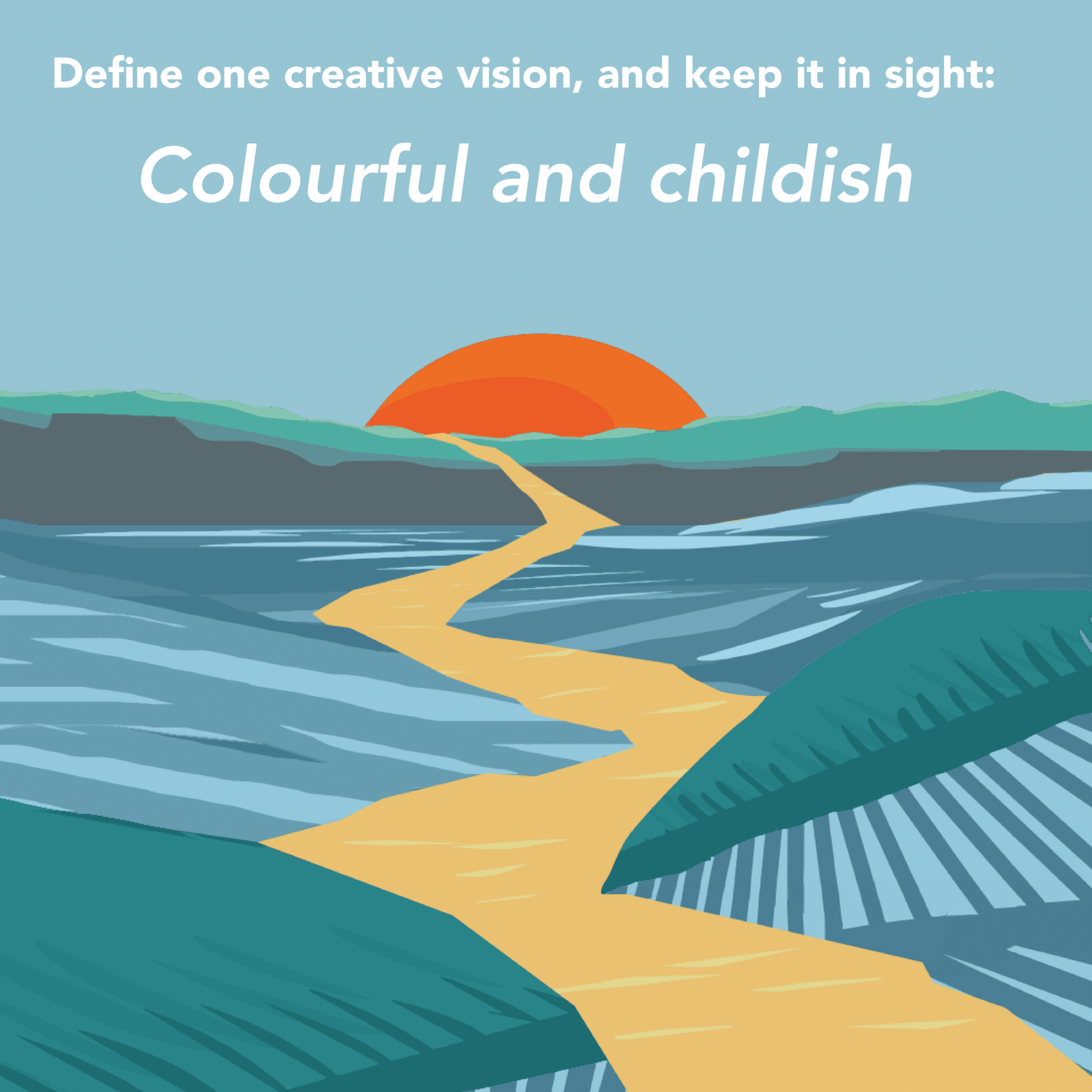
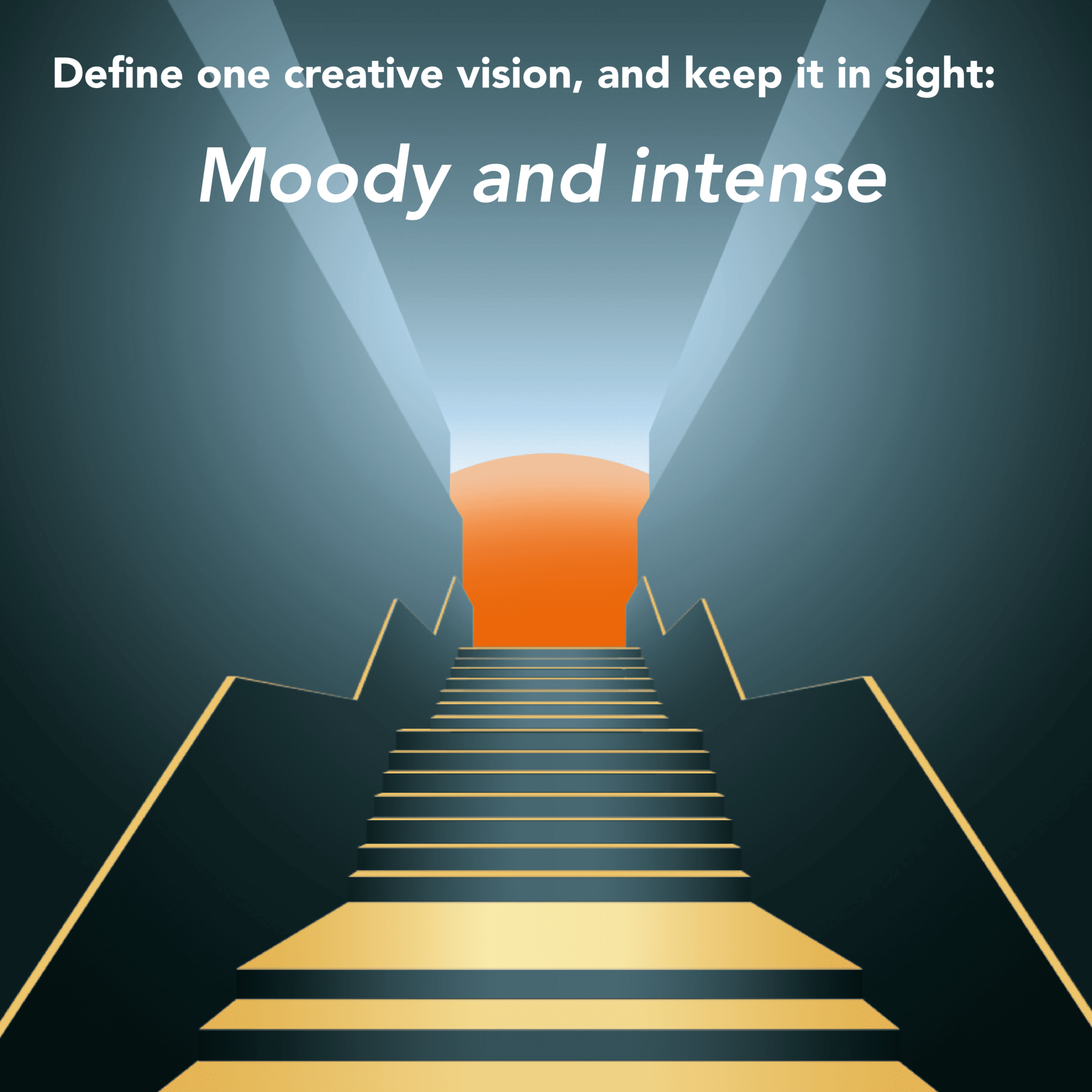
1) Define one creative vision, and keep it in sight
It’s easy to get lost in the details of a project and lose sight of the bigger picture. In the end, you’re left with run-of-the-mill design and a confused asset.
Instead, make sure you’ve got a big vision.
First, you’ll decide the single message you want to deliver with your asset. Then, write a simple phrase to guide your design. It should summarise the first impression you want to give your audience.
| Childish and colourful. | Moody and intense. |
 |
 |
KEY TIP
Avoid using generic positive words like ‘engaging’ or ‘interesting’
Whenever you review the design, start by asking: is the asset giving me the right first impression? And if the answer goes from ‘yes’ to ‘no’ after a round of amends? Consider reversing some of the changes.
2) Switch subjective debates for objective measures
Hand waving won’t help you craft effective design.
Gather three to five objective facts about your audience’s needs and how they’re most likely to use this asset. Then use our template to create three to five objective design requirements from those facts:
Our new brochure
| When our reader comes to this asset, they will: | This means the reader will: | So, our design should: |
| Have one, specific engineering project in mind | • Skim this document, not read it word-for-word • Check whether the product meets two or three key requirements |
Use bold headings and clear ‘chunks’ of content, making it easy to jump around |
Any amend you request should work towards these objective measures. If you keep this framework handy, you won’t compromise what matters most as you make changes.
3) Embrace emptiness
‘White space’ refers to the empty gaps in a layout. It’s not a mistake – it’s a powerful tool in the hands of a great designer. It makes the page more relaxing and draws the eye to important elements.
Think twice before you ask a designer to fill white space. Are you worried about leaving empty gaps? Or do you need to add essential elements?
This leads us nicely to the next hack.
4) Cut content as often as you add it
Often, layouts get more cluttered with each round of amends. To keep things simple, you need to break the cycle of ‘add, add, add.’
Every time you try to add a piece of information or visual element, ask:
a. What can I remove to make space for this?
b. Would this piece of information or visual be a priority for me, as a reader, at this stage of the journey?
5) Arm yourself with all the knowledge
When you deliver feedback on visual elements, consider a few key principles that your designer will care about:
| Hierarchy | Balance |
 |
 |
| Unity | Contrast |
 |
 |
| Proportion | Negative space |
 |
 |
Is there something else you find tricky about design in B2B? Something we haven’t covered? We’d love to help. Get in touch using our contact form.