


Written by Stephanie Vargas
Account Executive
As marketers, we strive to create impactful campaigns that capture attention, engage our target audience, and ultimately drive conversions. While content and messaging play a crucial role, the significance of colour cannot be underestimated. Colours have the remarkable ability to evoke emotions, influence decision-making, and shape perceptions. By harnessing the power of colour psychology, B2B advertisers can enhance the effectiveness of their campaigns and leave a lasting impression on their audience.
Colours can mean a lot of different things to different people, but the colour wheel below can be a good indicator of the connection between certain colours and emotions.
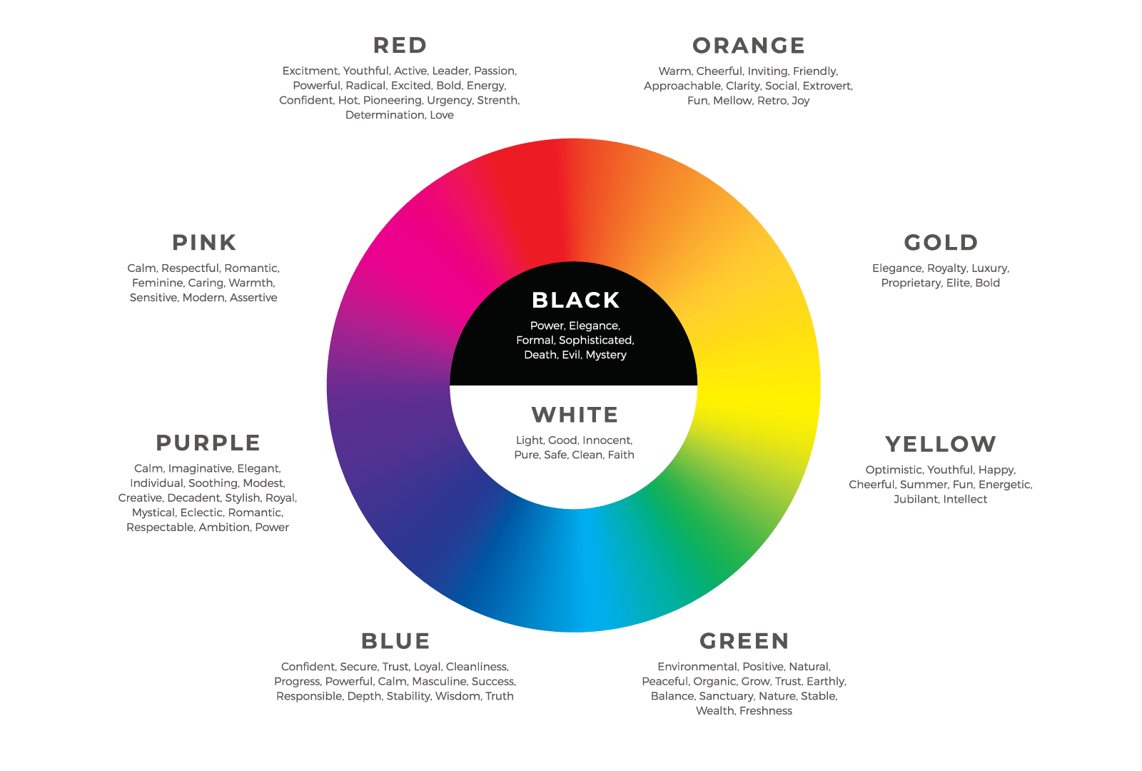
Image source: https://www.pyperinc.com/blog/the-psychology-of-color
Now, let’s explore some outstanding examples of how colour psychology has been successfully employed in B2B ads:
1. GE: “Building a world that works” ad uses a vibrant combination of colours like yellow, orange, and blue. These colours evoke feelings of joy, energy, enthusiasm, and productivity, demonstrating how General Electric fuels transformation and dynamism.
2. Adobe: “Creativity for all” incorporates shades of purple and pink. Purple symbolises creativity, innovation, and uniqueness, aligning with Adobe’s software solutions for creative professionals. Pink evokes a sense of playfulness and imagination, emphasising the fun and engaging aspects of Adobe’s tools.
3. IBM: “Let’s create smarter ways of putting your data to work” campaign effectively utilises the colour blue to evoke a sense of trust, reliability, and innovation. The video showcases the power of blue as a dominant colour, highlighting the company’s commitment to solving complex business challenges.
4. Mitsubishi Electric: “HVAC” employs a variety of vibrant and warm colours, including red, yellow, and orange, to convey positivity, and comfort, creating a cosy and engaging experience. The combination of colours can evoke a sense of fulfillment and vibrancy, making the ad visually and emotionally both appealing and memorable.
5. SAP: “Innovations” ad engages the viewer with the colour blue, enhancing trust, communicating professionalism, and promoting a sense of stability, intelligence, and calmness, resulting in a more credible, clean and engaging user experience.
These examples show how colour psychology can be effectively utilised in B2B ad campaigns to influence viewers’ emotions, perceptions, and actions. By leveraging the power of colours in advertising, brands can create more of an impact on their audiences affecting their emotions, capturing their attention, building brand recognition and becoming more memorable. So, when you plan your next campaign, remember to give due consideration to colours and and its impact on your brand’s effectiveness.
We make the complicated simple
Source on colour psychology: https://londonimageinstitute.com/how-to-empower-yourself-with-color-psychology/